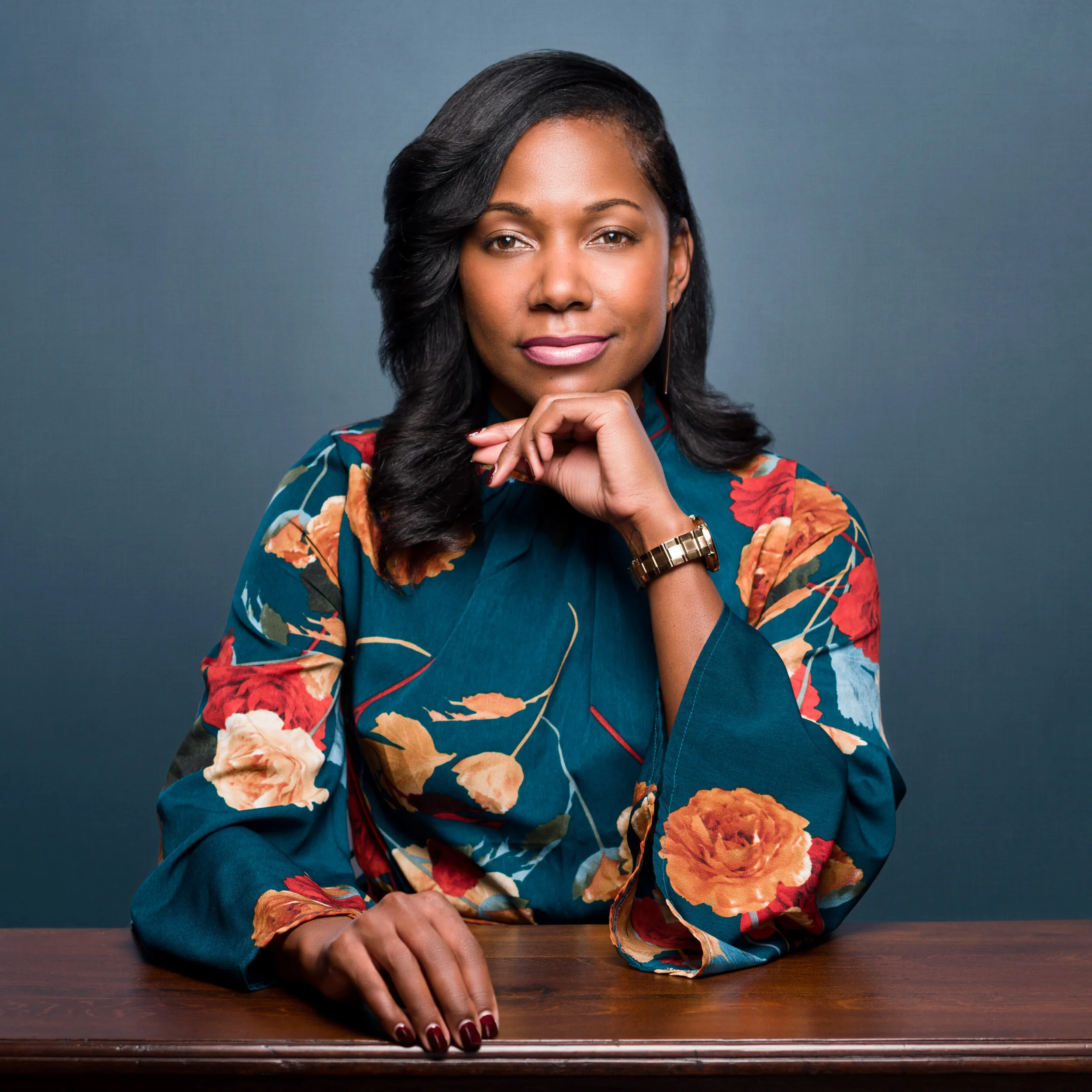
Medical field, personal and company website
The headshot in the jacket was for a company website which required the blue background. So I included both in delivery as a courtesy. The table shot was for a personal/business website. The reason for the alternate background there was to match the hue of the dress. I'm not a big fan of prints because I love faces and see prints as a competition to my subject's most important feature. So shifting the background to the same teal hue as the dress seemed like a way to help bring focus to her face. Since the gray is what we shot on, why not include that in the order? Of late I've been adding a bit of texture to my studio background shots. "Moire" and "banding" is becoming more and more of an issue on social media sites. Having some texture helps mitigate that. But even more than that, I love the look.


